What Is the Purpose of a SaaS FAQ Page?
A SaaS FAQ (Frequently Asked Questions) is an integral part of any Software-as-a-Service company’s website. The article exists primarily to answer frequently asked questions from users, and present information clearly and accurately that enhances the user experience. This is because SaaS companies are working with complicated products that are naturally in need of an explanation — and a good FAQ ensures that users can find a solution quickly, without coming and bothering support.
A good FAQ page decreases the number of support tickets, shortens the sales cycle, and assists prospects in decision-making. It addresses multiple audiences — existing customers looking for assistance, potential buyers considering the product, and users testing advanced functionalities.
Not only do they facilitate communication and trust between businesses and consumers, but SaaS FAQ pages also lead to improved customer satisfaction, customer retention rates, and general company credibility. A properly structured SaaS FAQ page can be a key conversion tool, showing the business’s commitment to transparency and customer care.
Table of Contents
What Does a Good SaaS FAQ Page Look Like?
A good SaaS FAQ page is not only a list of questions and answers. As a result, it is user-friendly, intuitive, and visually appealing. Here are some of the most important features of a high-performing SaaS FAQ page:
1. Well Defined Structure and Organisation
The best SaaS FAQ pages will group their questions into categories or sections to help users find relevant information as quickly as possible. Rather than attempt to wade through an endless buffet of unassociated questions, they keep related questions under the same header, like:
Billing and Pricing
Product Features
Account Management
Technical Support
For instance, HubSpot’s FAQ page is unique with its clean structure. Each one includes expandable question tabs so users can peruse questions without having to sift through tons of other details.
As well, HubSpot has buttons directing users to contact support or access the knowledge base. Combining self-service with personalized guidance, this dual approach is designed to make the experience of onboarding relatively painless for new users, while also providing more advanced users with resources to reach their goals in a timely fashion.
2. Concise and Direct Answers
A well-written SaaS FAQ page gives short, no-nonsense answers that are easy to follow. Long answers can irritate users, dissuading them from reading on.
Example: Slack’s FAQs page does a great job of providing short, informative answers to popular questions.
Slack provides links to detailed articles and guides for more complex queries, allowing users to dig deeper into specific subjects as necessary. This tiered method maintains a sleek and minimal FAQ page and enables all the support you need.
3. Search Functionality
The FAQ page has a search bar that allows users to enter keywords to quickly find the answers they are looking for. This is particularly useful when it comes to SaaS platforms packing a complex combination of features serving an equally complex base of customers.
For example: Zendesk features a large search bar at the top of its FAQ page. Users can enter questions themselves, and within seconds view relevant articles and answers.
Auto-Suggestions (Zendesk): Auto-Suggestions are an enhancement to the search function that helps users create their queries quickly and find relevant content without going through various sections manually.
4. Visual Elements and Multimedia Support
Visuals such as images, videos, and infographics help users understand better, particularly on complicated subjects. Video tutorials, screenshots, and step-by-step guides can do a better job of clarifying processes than text alone.
For example, Dropbox’s FAQ page combines video explanations along with written responses. Here is a multimedia approach, so users can choose their way of learning.
Through annotated screenshots and animated GIFs, Dropbox also steps in to simplify complex workflows, aiding users in following along and accomplishing tasks without needing means from outside assistance.
5. Mobile-Friendly Design
Also, as a large chunk of web traffic comes from mobile devices, SaaS FAQ pages must be responsive and mobile-friendly.
For example, the Trello FAQ page is completely optimized for mobile devices. This responsive design helps users navigate the page and access information easily on the biggest or smallest of screens.
Trello is another one where, if you’ll notice, it has very touch-friendly, expandable menus and very large, readable fonts, so people who use mobile screens can read everything you have to offer.
6. Regular Updates
A SaaS product is ever-evolving, with new features, pricing models, and policies being rolled out on a seemingly constant basis. The best SaaS FAQ pages are updated regularly to stay in tune with these variations.
For instance, the FAQ page by Intercom is continuously updated with the recent product changes and updates. This is how we ensure users always get accurate, up-to-date information.
Intercom marks questions that are newly added or frequently updated, to ensure that returning users can easily find out what has changed without having to read the entire FAQ again.
Top Examples of the Best SaaS FAQ Pages
Here are some of the top SaaS companies that uses their FAQ page to practice what they preach:
1. HubSpot
Their FAQ page by HubSpot is designed around user experience, allowing visitors to quickly find what they need. It also divides the page into distinct categories like “Getting Started,” “Pricing & Billing,” and “Advanced Features.” By segmenting your content, users can jump directly to the part that interests them without being overloaded with unnecessary information.
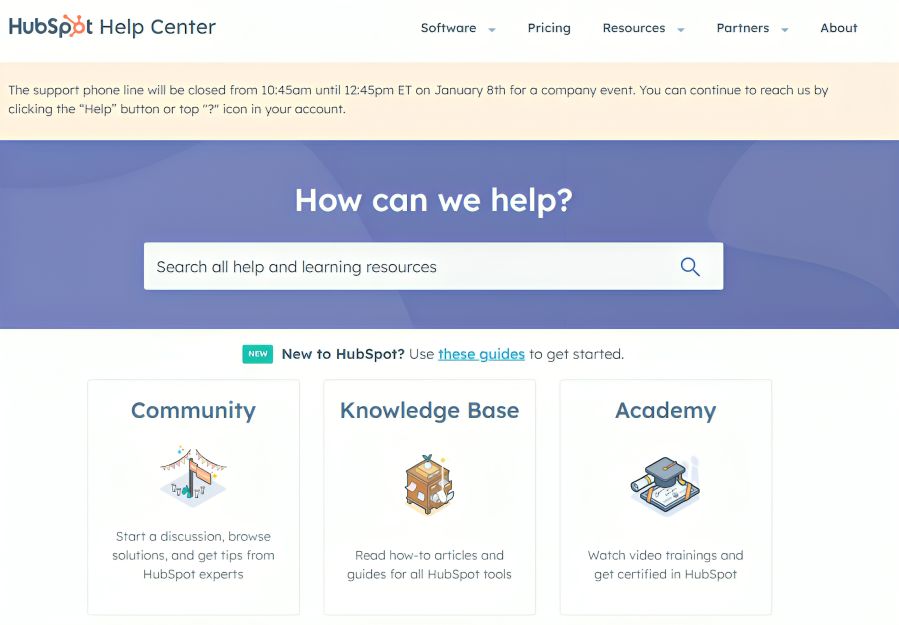
To keep the clutter down to a minimum, the questions appear in a collapsible fashion. When a user clicks on a question, the answer pops up beneath it, keeping things cleaner and allowing for easier, distraction-free scrolling. It prevents the page from being too long, which is a problem with lots of FAQ pages.
HubSpot also enhances user support by incorporating a live chat widget. This enables users to ask questions and receive answers in real time without leaving the FAQ page. In addition, they provide a link to the community forum for users to participate in discussions, share insights, and assist one another. Users have immediate answers for their problems and a sense of community, giving them the choice of how they want their issues handled, while a two-tier support system elevates their entire experience.
2. Slack
Slack’s FAQ page is unique because it is simple and uses much less literal and sometimes technical language. The reason is that the answers are short and to the point, and so they allow users to quickly grasp important ideas without having to scroll through walls of text. This may seem simple but is highly impactful for individuals who want answers quickly and do not want to take the time to sift through too much information.
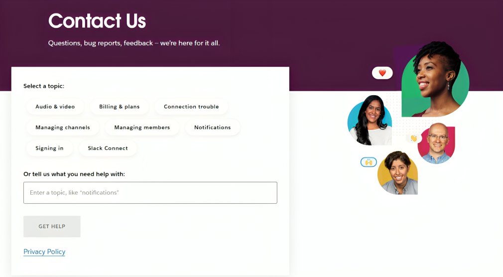
For those who need to be walked through a bit more, Slack also takes things a step further, including links to in-depth guides. Guides guide readers step-by-step on various topics, elaborating on subject matter with in-depth detail targeted to users who may want to learn more. This combination of short, simple answers and the ability to read more detailed resources means that Slack’s FAQ page caters to a diverse audience, from people simply looking for fast clarification on specific questions to those who want a deeper dive into how the app can benefit them.
3. Zendesk
Zendesk’s FAQ page is great because it has a powerful search and is clean and easy to navigate. With precise search bar capabilities, readers can filter out everything else to get exactly what they want. This enables visitors to find answers quickly without having to browse through many options.
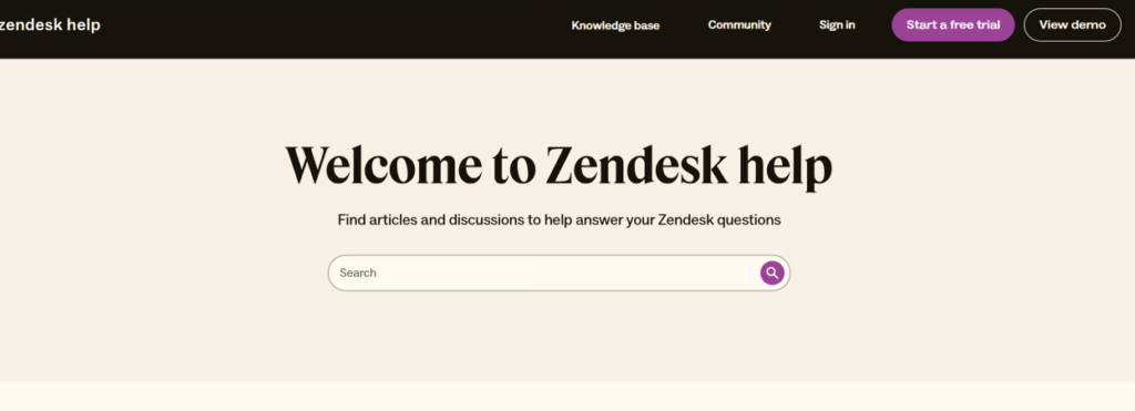
There are helpful articles for troubleshooting and you can add that you have a support chatbot from Zendesk which will give instant assistance. It’s meant to answer frequently asked questions and direct users to appropriate resources quickly. If the chatbot is unable to fully resolve the issue, it can easily transition users into human support, thus blending the high efficiency of automation with the personalized touch of human assistance.
This combination of self-service and human interaction not only makes this process more seamless, but it makes sure that users are able to get help at any stage in their journey. So whether these users are searching for self-service answers or require personalized attention, Zendesk’s FAQ page strikes a happy medium that dramatically enhances the user experience.
4. Dropbox
Using a split of text and video, Dropbox’s FAQ page addresses different learning styles. For text-based answer fans, the written responses are spot on and generally to the point, addressing a variety of different subjects. For visual learners, Dropbox adds videos that provide brief, easy-to-follow tours of common processes and troubleshooting steps.
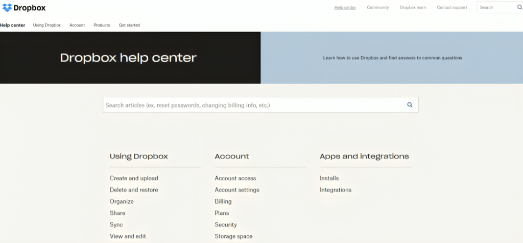
These videos are particularly useful, as they walk the user through solutions, making it quicker and more interesting than a long set of instructions. This way, users in need can find the support they are looking for in a format that works for them instead of reaching out to support, thus allowing them to resolve problems faster, on their own. It adds to the user experience as it is more flexible, simplifying problem-solving.
5. Canva
Canva’s FAQ page does more than simply respond to commonly asked questions; it focuses on educating users with materials that promote diving in and getting creative with their tools! The page is grouped under clear categories like “Creating Designs,” “Billing & Teams” and “Print Products,” which helps the users cord the doubt, from the area they are facing an issue.
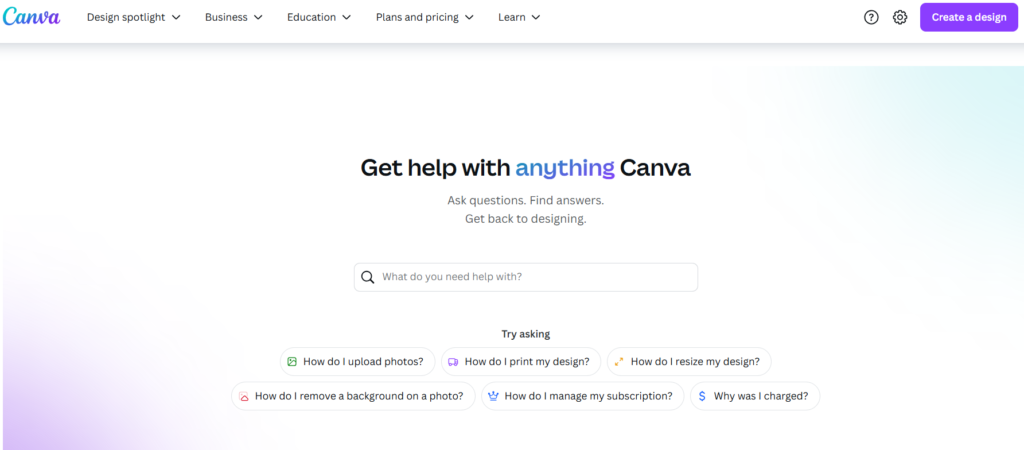
Along with answering those rudimentary questions, there are links to tutorials or design inspiration, creating a world where users can develop and get creative. This is especially important for those who don’t merely want the problem fixed, but want to fully realize the benefits of the system.
This is complemented by a searchable experience with a huge search bar as one of the significant elements of the interface. Canva’s FAQ page provides a thorough, and highly engaging experience that inspires users to discover everything the platform has to offer by combining educational content with practical solutions and access to advanced features.
6. Asana
The minimalist design of Asana’s FAQ page shines through by focusing on simplicity and ease of navigation. Its simplicity enhances readability, making it easy for users to find the information they need without feeling overwhelmed by too much content. Quick links show popular questions, and users can get instant answers to the most relevant questions.
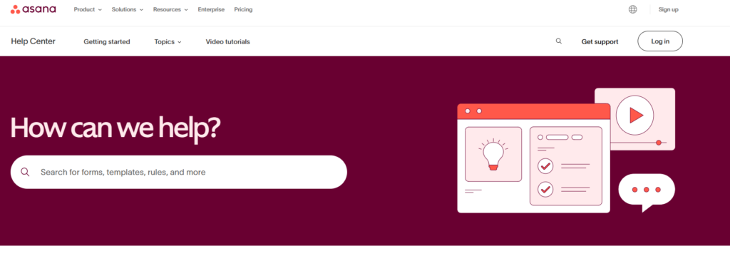
Outside of static information, Asana has in-depth guides on project management best practices. Not only do these guides solve frequently asked questions, they also support users in using Asana correctly to manage projects effectively — adding value beyond just solving technical issues.
Asana also offers a live chat option for people who need immediate help. This feature influences the user experience positively by enabling the users to interact with a representative, receive immediate answers, and solve problems quickly. Combining static info with real-time help here makes Asana’s FAQ page a holistic and user-centric solution to a wide swath of user asks.
7. 15Five
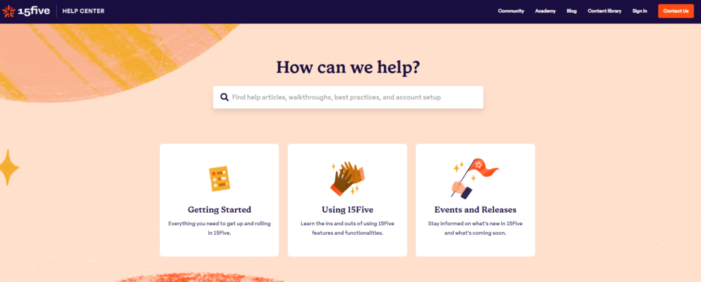
15Five: A centralized performance management software solution that helps managers lead and develop their teams by actively monitoring, tracking, and quantifying performance metrics. This platform offers tools that enable continuous feedback, goal tracking, and employee development, which help teams stay aligned, engaged, and productive.
A notable feature of 15Five is its high-quality FAQ page. Not only does it look great and feature a well-organized layout,but this resource is quickly referred to for FAQs managers and team members alike might have. The FAQ page is a great resource for getting detailed explanations about the software, why it’s designed that way, and how to link everything to best practices for effective performance reviews. It very much puts the power in the hands of users, enabling them with clear and concise responses that help maximize the platform’s capabilities and drive improved performance within their teams.
Best Practices for Creating an Effective SaaS FAQ Page
- Know Your Audience
When designing an FAQ page, ensure you know what your users want. Collect data from customer support tickets, feedback forms, and user surveys to see what the most common questions are.
- Use Simple, Clear Language
Do not use jargon and technical terms without sense. If you use technical language that may not be familiar to the reader, offer definitions or explanations to help them understand what you are saying.
- Offer Multiple Formats
Develop answers in text, video, and step-by-step processes to meet users’ needs.
- Incorporate Internal Links
Within the answers to the SaaS FAQ, link to relevant articles, product pages, or tutorials. This makes navigation easier for you and also gives more detailed information to users.
- Track User Behavior
Utilize analytics tools to make note of how the users are interacting on your FAQ page. Track which questions are most often viewed and where people lose interest. This data helps us identify areas for improvement.
- Provide a Feedback Option
Consider letting users submit feedback on” A basic “Was this answer helpful? prompt can provide valuable insights for refining content.
Conclusion
A well-designed SaaS FAQ page is an essential part of customer support and engagement. Clear, actionable answers to common questions improve user satisfaction, lower support costs, and enable conversions.
SaaS businesses can build FAQ pages of their own that address user pain points while validating the brand by following best practices and drawing inspiration from these top examples. So, whether you are a startup launching a new product or an established SaaS provider who you want to improve customer support, investing in a high-quality FAQ page is a strategic move that pays dividends in the long run.
FAQ pages are not simply a support tool, they are a crucial part of the overall customer journey. By constantly updating the content, organizing the information in a logical and easy-to-navigate structure, and focusing on the user, SaaS businesses can evolve their FAQ sections from mundane, one-off tasks into growth modules for profitability from satisfied customers.
You might also be interested:


