If you have a SaaS business you know that your website is the gateway to bringing people in to customers. But crafting a SaaS landing page that not only ranks in Google but also converts visitors to loyal customers is quite an art that demands an insightful strategy.
Over the years – after creating hundreds of SaaS landing pages for small startups to multi-million dollar businesses – we’ve found a formula that works. Our formula is far more than just a pretty page; it’s how we structured your content so it captures traffic in search engines while also persuading visitors to become paying users. Here’s our comprehensive landing page strategy to do just that
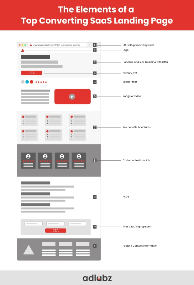
Table of Contents
1. Hero Section: The First Impressions Matter
It is the first thing visitors will notice when they land on your page — the hero section. It’s the opportunity to make a first impression that lasts. An effective hero section does the heavy lifting — catching people’s attention, establishing trust, and leading visitors to the next step in their journey.
Company Logo:
Branding is essential for every business, especially SaaS. Add your company logo at the top left or center of the page. This straightforward step helps someone immediately identify your product and builds familiarity. Having a good logo design also helps improve brand trust.
Tip: A high-quality logo that can be easily adjusted for different sizes and is great on mobile devices.
For example: Slack’s logo is a brilliant example of simplicity and versatility in modern branding. It features a vibrant color palette and a hashtag-like symbol made up of four lozenges and four speech bubbles, perfectly representing collaboration, communication, and connectivity—the core functions of the platform.
Headline:
Your headline is the first line of copy your visitor will read, and therefore it should be attention-grabbing, benefit-stating, and as clear as possible. A compelling headline must address the critical question of what on Earth should care about this product.
Your headline instantly conveys the value of your SaaS offering and what problem your product is solving. Appendix Avoid buzzwords and be specific.
Example: “Easily Create, Share and Optimize Your LinkedIn Posts.”
This benefits-passionate headline conveys to the user right away the core value of the product and motivates him/her to learn more.
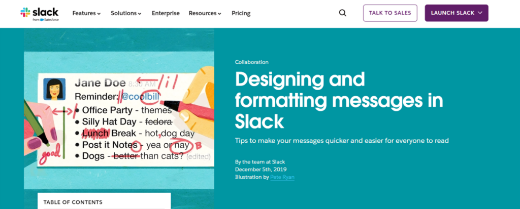
The headline “Designing and formatting messages in Slack” is clear, actionable, and perfectly suited for its purpose.
Subheadline:
The sub-headline backs up the headline with detail and clarity. It’s your opportunity to elaborate on the value proposition and provide the visitor with greater detail into why your product is worth considering.
For example: “Kleo is a free browser extension that makes it easy for professionals to discover and create high-performing content for LinkedIn.”
The sub-headline is about giving some clarity without the visitor getting too much information. It’s more about context and creating curiosity of the user around the product.
Primary CTA (Call to Action):
The CTA is the single most important element on your landing page. The most important one should guide users to the right action. It must be easy to find, should be visually distinct, and, most importantly, must match the user’s journey.
Make sure that your main CTA encourages action and includes a clear next step (like signing up for a free trial, product installation, or a demo)
Example: “Install on Chrome”

For an additional enticement, add urgency or a benefit to your CTA. Phrases like “Get started for Free” or “See How It Works” can drive that come in.
tip: Make your CTA button one color, use a contrasting color for the rest of the text.
Social Proof:
Social proof establishes credibility and trust. On the hero, include social validation like testimonials, number of users, and logos of popular brands using your product.
For example: Asana showcases its credibility with the claim that 85% of Fortune 100 companies rely on its platform for their project management needs. This statistic reinforces Asana’s reputation as a trusted tool among top enterprises.

Demonstrating user numbers or familiar brands will help visitors feel confident that they aren’t the first to give your product a go. If they see that others like them are already engaging with your product, trust will sour more quickly.
Image or Video:
Visuals are important for showing users how your product works and what it looks like. A product screenshot, a demo video, or even a short GIF, the image in the hero section should support the value proposition and show the product in action.
Example: Use Either Product Screenshots or Videos that Showcase SaaS Product Functionality in Real-World Scenarios This enables users to quickly understand the benefits of deviating from their usual plans.
2. Benefits Section: Show Your SaaS Product’s Real Value
The benefits section is where you get to tell your prospects why your product is worth it to them. This is where you can demonstrate how your product can solve your customers’ problems and improve their lives.
Key Benefits:
Focus on the benefits instead of jumping into features. Benefits are what will make the user’s life better after using your product. That shows how your tool saves time, reduces headaches, or solves pain points for SaaS products.
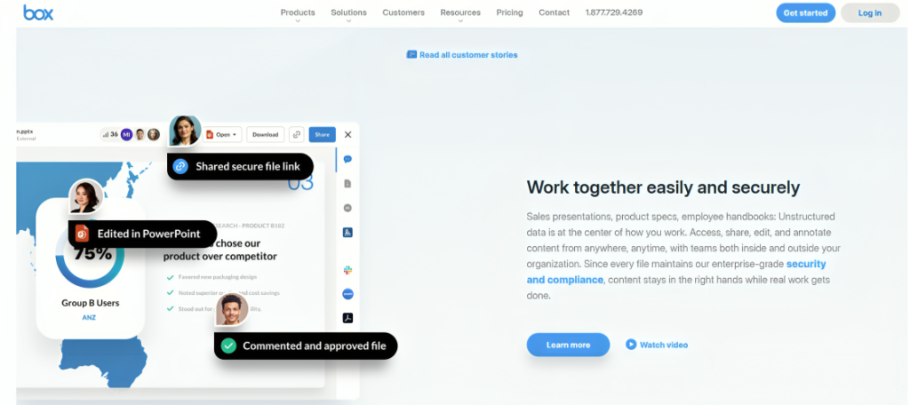
Explain each benefit shortly, and add a visual to support it. So, if your product enables users to better track data, illustrate a benefit, such as: “Insights at Your Fingertips with Real-Time Data Tracking.”
Supporting Visuals:
Next make sure to add an image, an illustration, or a GIF beside each benefit and allow users to picture in mind the value you intend to bring. A product demo video is effective in this area too, especially if it highlights multiple benefits in action. Visuals are critical to connecting with the user and augmenting your messaging.
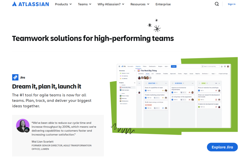
Tip: Don’t fill images with clutter. Seeing them in action allows you to see the clear benefits.
3. More Social Proof: Trust, Testimonials, and Case Studies
At this point, visitors know quite well what your product does, and how it can help them. For social proof, the next step is to keep building trust. People are also likely to trust something that has been suggested to them by others, so case studies or customer reviews can be highly convincing.
Testimonials:
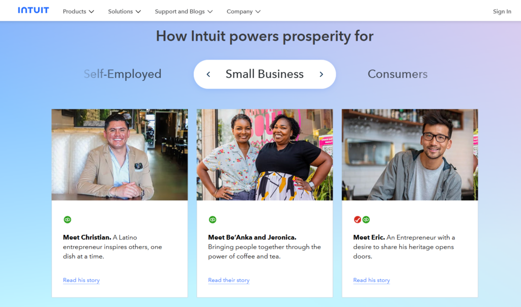
There are many powerful ways to validate credibility- Customer Testimonials are one of those. A testimonial is a concise, believable, relatable testimony, preferably given by a customer that fits your ideal customer demographic. Adding their name, title, and company will make it more credible.
If you have a picture of a customer use it, it adds a human touch and makes the testimonial so much warmer.
Trust Signals:
In addition to these, trust signals in the form of logos of big brands and media outlets that have written about your SaaS product add further credibility. These assist with providing visitors assurance that you are a credible company.
For example: “XYZ Corp, ABC Solutions are using it. Mentioned in TechCrunch.”
4. FAQ Section: Address Concerns and Boost SEO
There’s an FAQ to clear up any common doubts or worries. If you address common questions, you can eliminate friction and make sure users are not leaving the page with unanswered questions.
Address Common Objections:
Be prepared for any pushback visitors might have and answer their objections. Are there security concerns? Q 3. Is software usage with a third party also feasible? Does it integrate with what other tools? These are two of the common questions that can influence the visitor’s decision.
EXAMPLE QUESTION: “Is Kleo detected by LinkedIn?
SEO-Focused Questions:
This section includes long-tail keywords and key phrases that the users can search for. If you include answers to these questions in your landing page, your SEO will work better, meaning that you will be able to rank for more specific queries.
Pro-tip: Use Google Autosuggest, or keyword research platforms to find out what questions are people asking in your area of expertise.
5. Final Call to Action (CTA): Prompt Immediate Action
At this point in the visitor’s journey, they’ve learned a lot about your product and are prepared to take the next step. For the last CTA, prompt them to take action — to sign up for a free trial, start a demo, or subscribe.
Example: “Trying Kleo for free today!”
Make It as Scrumptious as You Can Include action verbs and urgent language like “Get Started,” “Join Now” or “Try It Free.”
6. Internal Linking: Don’t Let Users Leave
Now that you have a visitor hooked in, the last thing you want to do is have them skim along your site. Use internal links that draw readers to feature pages, other related content, or blog posts designed to provide additional information. This motivates people to consume more of your content which could convert into sales.
For example: “Check how you can preview posts with Kleo.
Such internal linking leads the user further down the funnel — which in turn improves engagement and the length of the session.
7. Mobile Optimization: Don’t Forget Mobile User
SaaS landing pages must be completely mobile-optimized because mobile traffic is now surpassing desktop traffic in many industries. Such as fast load times, intuitive navigation, and responsive CTAs.
Tip: Make sure to test your landing page on different mobile devices to look good on all screen sizes. Fire Optimize and never stick with any large files that are taking a lot of time to load.
8. Footer Section: Important Info in a Compact Area
Many people ignore the footer but this is an essential part of the user to acquire information.
Contact Information:
Add a contact form, or at least an email address, phone number, and a link to your support team. Help users to get in touch easily in case of any questions.

Legal Information:
Include links to your Privacy Policy, terms of service, and any other critical legal disclaimers. Be Trustworthy In accordance astir compliance-heavy industries, this adds certainty and transparency to your page.
9. Repeat for Every Feature: Optimized for SEO and Conversion
The SaaS landing page isn’t a one-off exercise. About 2 months back we advised a B2B SaaS company to create 8 feature specific landing pages. After implementing this tried and tested framework, here’s what they were able to accomplish:
• These pages focused on keywords directly related to their product.
• They received over 20,000 SEO visitors a month.
• The pages turned these visitors into paying customers.
This is the power of having a structured landing page plan derived from data. When it comes to your SaaS Landing Pages, they can be your most impactful marketing tool when done the right way.
Conclusion:
How to Make Landing Pages Work?
Making a landing page that ranks on search engines and converts visitors isn’t just about looks — it’s about implementing an action-proven strategy. This step-by-step action plan can help you create landing pages that not only rank in Google but drive conversions and scale your SaaS business.
Implement this framework today and see your landing pages convert traffic into paying customers — again, and again, and again.
You might also be interested:


